Apr 15, 2021 | 7 Min Read
If you want your health app to flourish, keep these tips in mind. These techniques have an important goal. They’ll get people to use your app for a long period of time. And that’s important when users are trying to achieve results in their health journeys.
We recently examined a few reasons why so many digital health apps fail. The reality is, designing experiences that are conducive to meaningful behavior change is hard.
Here are eight techniques to consider when designing digital health apps. These techniques can help you attract users and keep them engaged long enough for them to achieve their health goals.
1. Provide Sources of Credibility
Build trust by sharing credible sources of information, reviews, testimonials, and credentials in your app’s description and website.
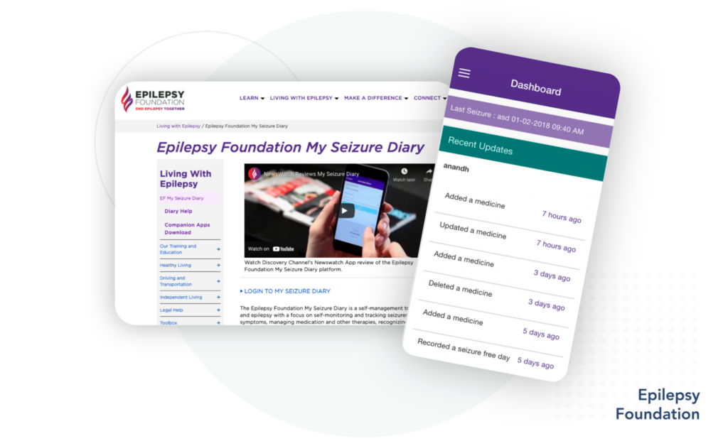
Example: My Seizure Diary by Epilepsy Foundation of America features its app on the foundation’s website, citing the Discovery Channel’s coverage of the app. The well-placed reference to the Discovery Channel enhances the app’s credibility through association with the well-known channel.
2. Clearly Explain How Personal Data Is Used
Be transparent by always providing a clear explanation of how data is used. This information should be readily available and in plain language, not hidden deep in the app’s information architecture. If applicable, users should be able to opt-out.
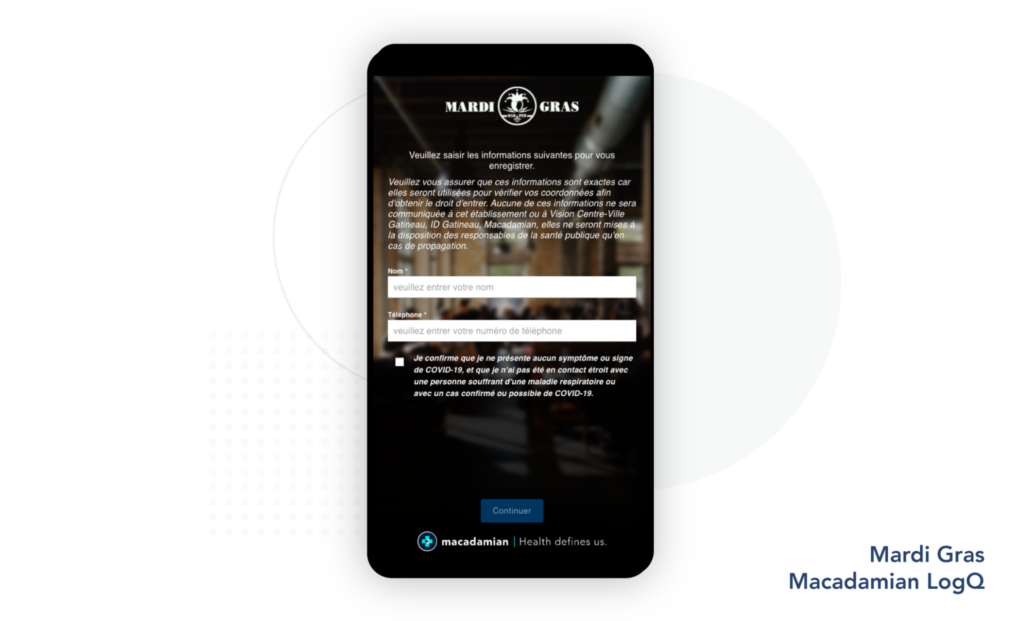
Example: LogQ is a mobile registry solution designed for restaurants and bars to securely validate and maintain client contact details for 14 days. As people log in, the app reassures them that the data will “only be made available to public health officials in the event of a spread event.”
3. Feature a Theme or Story
Implement a consistent theme or story that creates a welcoming and pleasant experience. The aesthetics may include elements such as:
- colors
- imagery (pictures and videos)
- audio
- tone
Pick them carefully so they match both the intent of the app and the users’ goals. For example, an app to monitor pulmonary disease shouldn’t feel sterile like an operating room, nor should it be designed like a video game. There is a fine line between engagement and entertainment, and this line may differ among users.
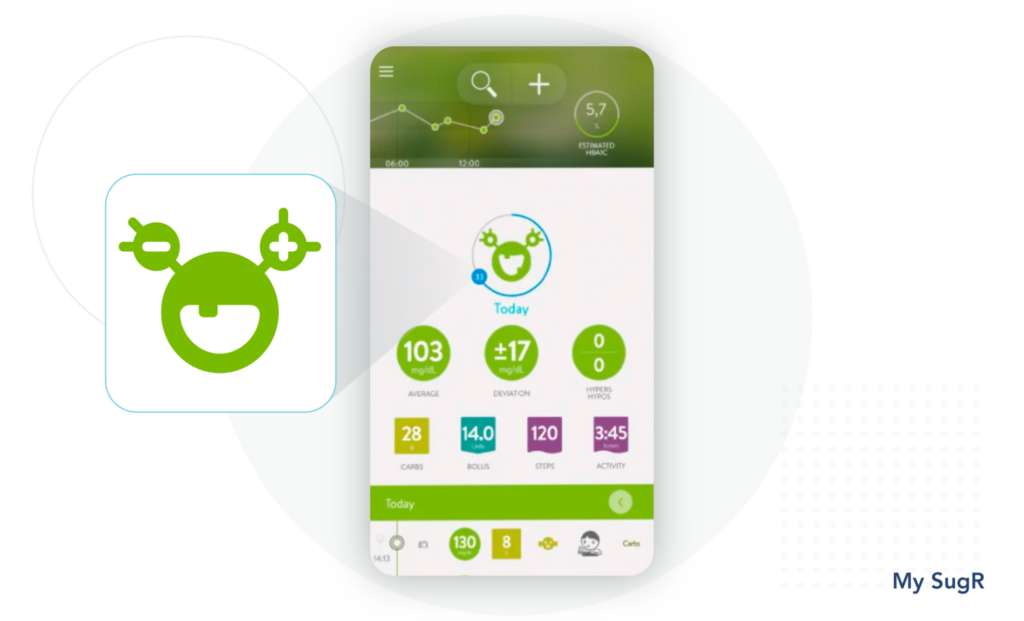
Example: My SugR app uses humor to make content stick. It personalizes a diabetes monster, which “jumps around, laughs, and makes a bunch of funny noises,” according to the app. While some users respond well to the humorous monster, it might not sit well with others.
4. Help Set Individualized Goals
During their early interactions with an app, users are often asked to set up goals. These goals need to account for users’ preferences and needs, and to allow them to go back and change them later, if they wish to do so.
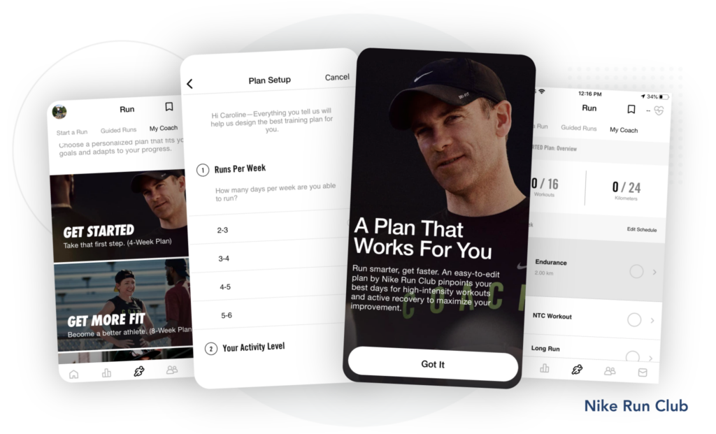
Example: Nike Run Club lets users select a training type for a given distance, based on the user’s current level of fitness. In only a few steps, a personalized plan is created.
5. Highlight the Relationship Between Goals and Health Outcome
People need to understand the relationship between the goals the app offers and their health outcomes. This relationship is not always intuitive, particularly in the context of medical conditions. For example, drinking water may be a goal for epilepsy. But it might not be immediately clear how hydration may alleviate epilepsy-related symptoms.
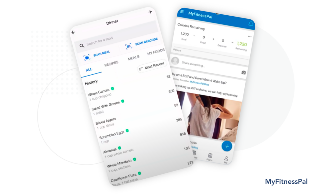
Example: MyFitnessPal provides nutrition-related content snippets on foods entered. By embedding information about good and bad choices into the journaling experience without requiring any extra action, users absorb this content, and as a result, they make better food choices.
6. Provide Feedback to Users
Offer well-timed feedback. This gives people visibility into their progress, motivates them, and equips them with the knowledge needed to revise their goals, if necessary.
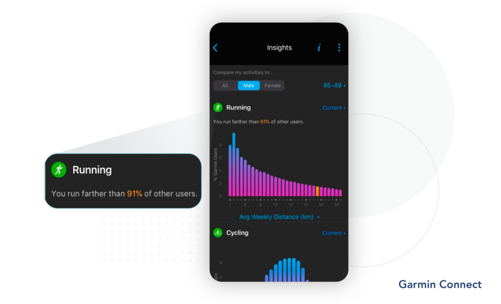
Example: Garmin Connect compares a runner to others as part of their last run’s insights section. No action is necessary on the user’s part. By using statistics and social comparison, good performing runners are encouraged to keep up their running habits.
7. Provide a Sense of Community
People are social creatures. Offer a sense of community by allowing them to feel connected to others in the same situation. Including social or ‘community’ features provides an additional mechanism for support, motivation and sharing.
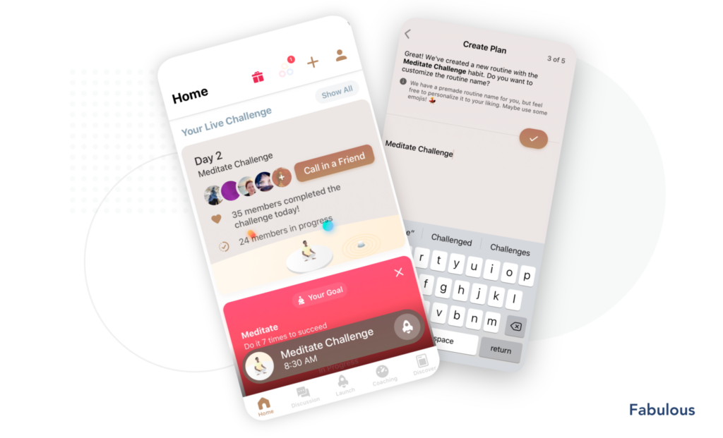
Example: Fabulous is an app that helps people build healthy habits. The app offers Group Challenges which allow users to experience a sense of social commitment. Social commitment is a great technique to help users stay on track.
8. Create Opportunities for Contribution
Invite users to be co-contributors. Give them the opportunity to influence the app’s vision and purpose. Allow them to provide feedback, share their suggestions, and also their expertise.
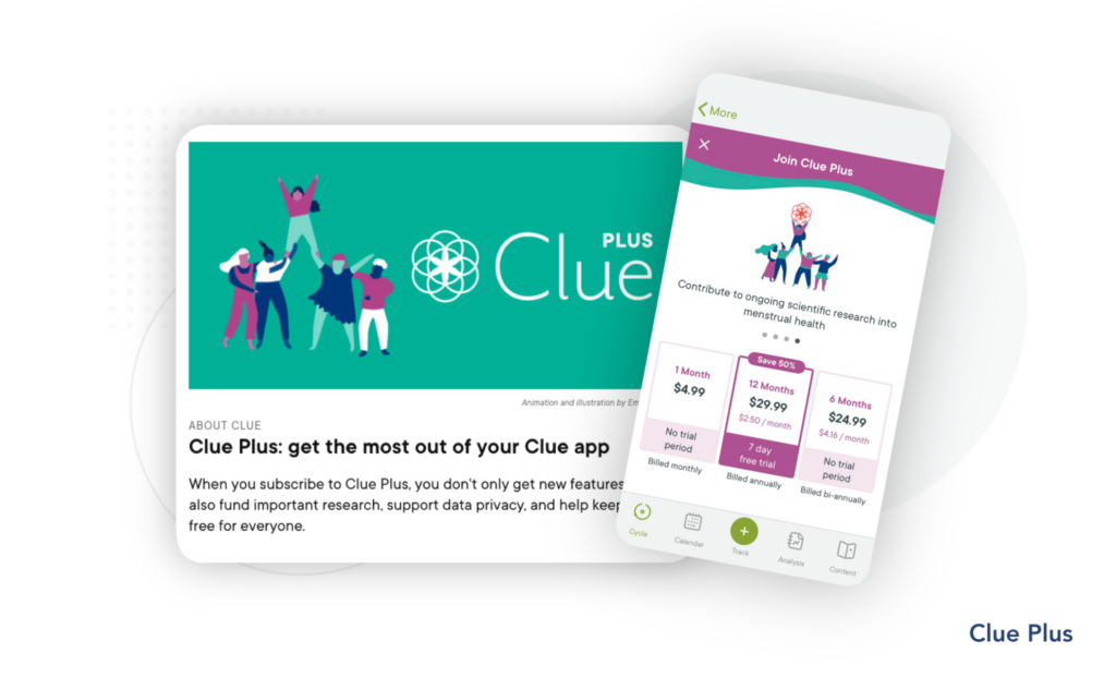
Example: Clue Plus expands one’s knowledge on menstrual health. The app allows users to contribute not just to the app, but to a greater cause of supporting a female-led team to help advance research in that field.
Assess How Well Your Application Supports Behavior Change
There is a lot to think about when designing apps to support or promote behavior change.
We will discuss this further in our post on the ARC framework. Essentially, the ARC framework can be used to evaluate how well your application will help people change behaviors to achieve certain health outcomes.
This framework can help you answer questions like:
- Are you taking into account the user’s evolving needs over space and time?
- Are the content and functionalities of your app well-timed and aligned with people’s journey through the app?
If you’d like to understand how your application design could be enhanced or improved to increase adoption and retention rates, and overall user satisfaction, reach out to connect with our experts.